Chris Ernst

Hey! I am a User Experience Designer / Product Designer / Amateur Tinkerer specializing in complex (enterprise) systems looking for the Next Big Thing in my life. Do you have a Next Big Thing for me? Excellent! You're in the right place. I'm a little bit technical, I'm a little bit creative, I'm a little bit country, and I'm a little bit rock n' roll. I love pushing my existing skills to the limits and being forced to get good at new ones too. I'm looking for an opportunity and team that can teach me just as much as I teach them.

Who Am I?

Hmm, that's a great question, actually. I should figure that out. //todo: figure self out;

Here's the progress so far:

  • Education
    • BS Computational Media
    • MS Music Technology
    • MS Human-Computer Interaction
  • Professional Experience
    • Lead / Senior UX Designer - NCR
    • UX Designer - Elavon
    • UX Developer - Coca-Cola
    • UX/NodeJS Developer - BitPay
    • Digital Handyman - Georgia Tech

What Can I Do?

Design

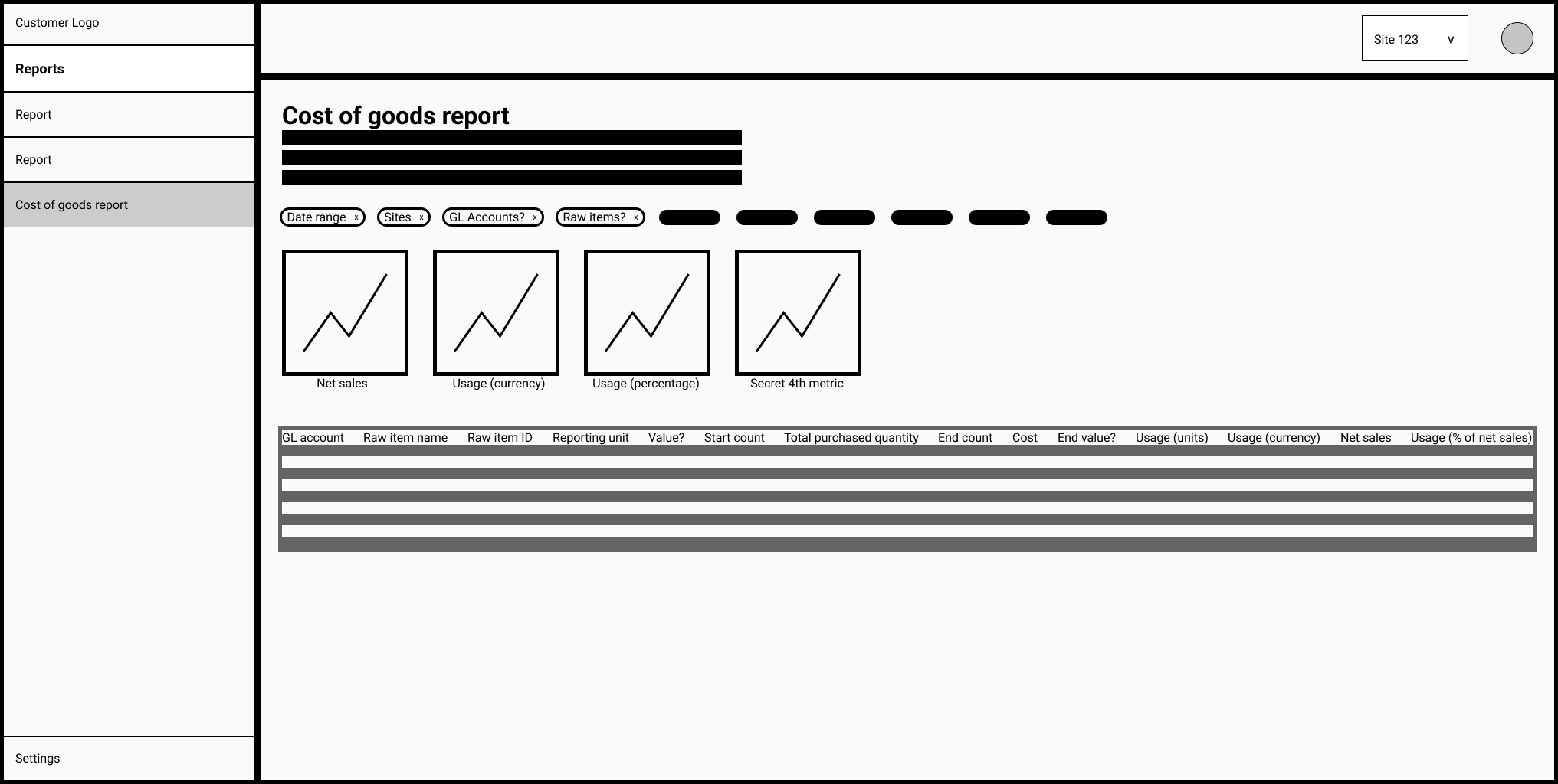
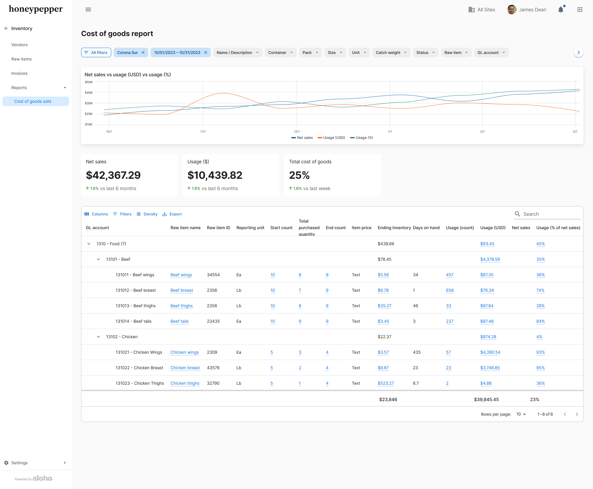
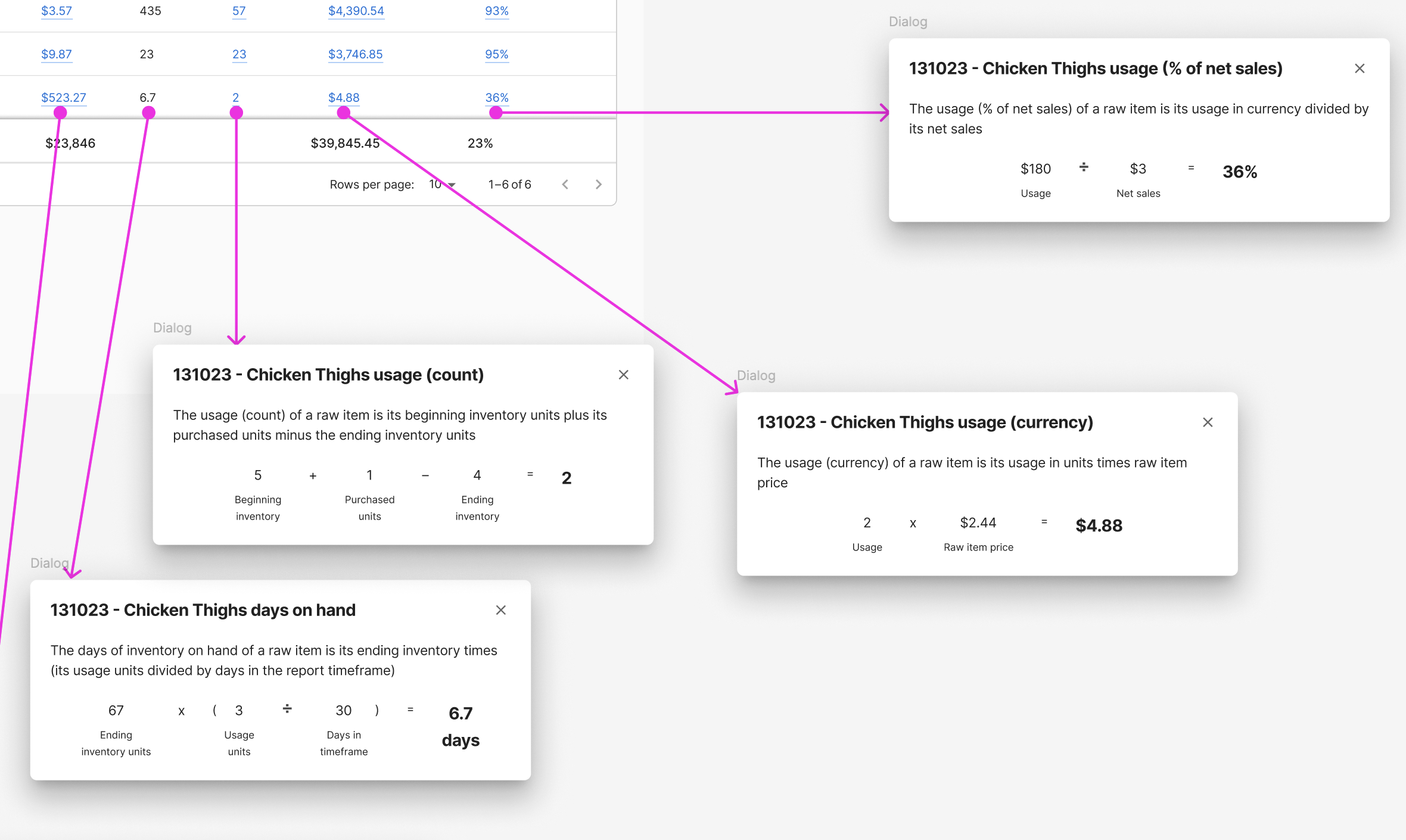
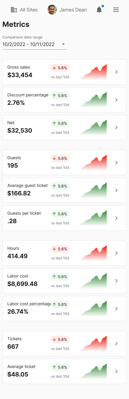
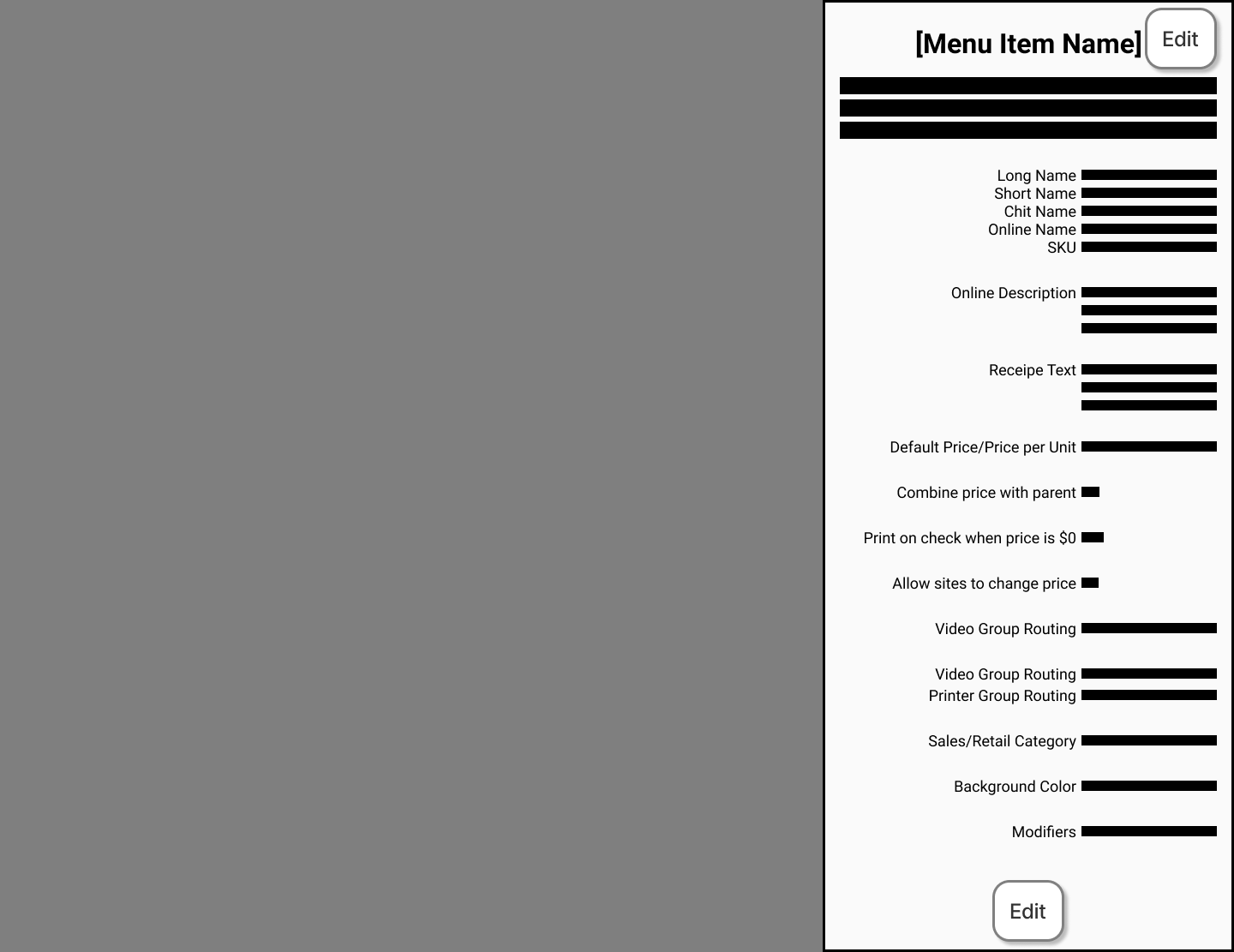
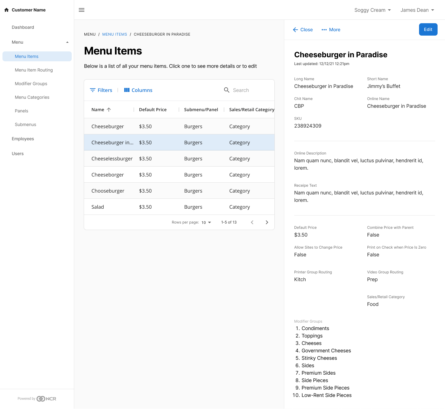
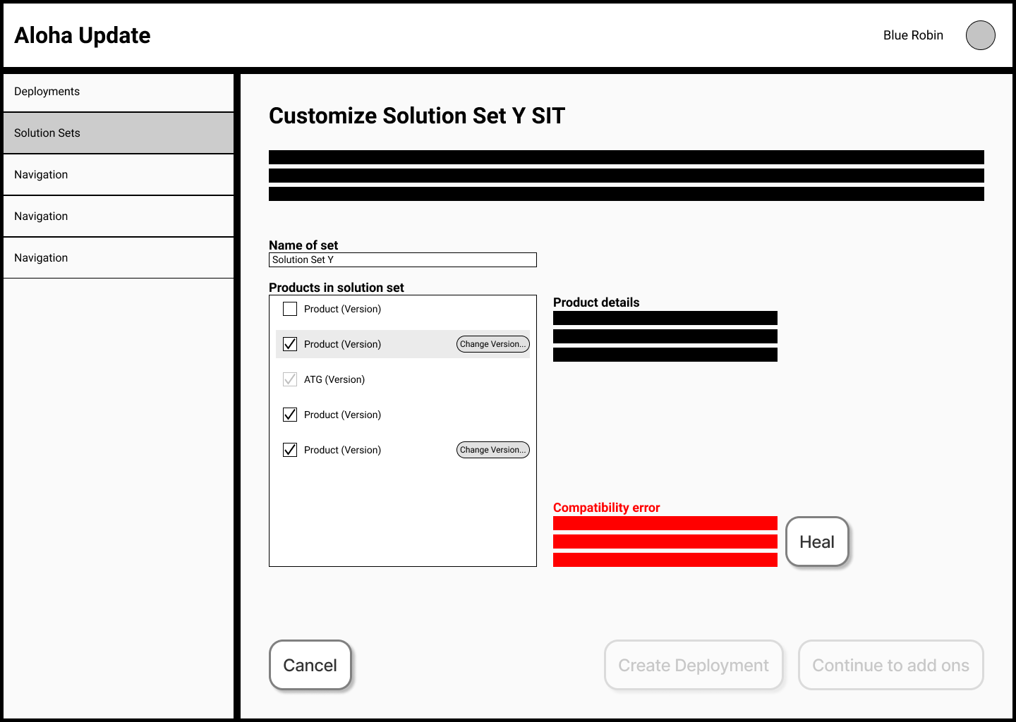
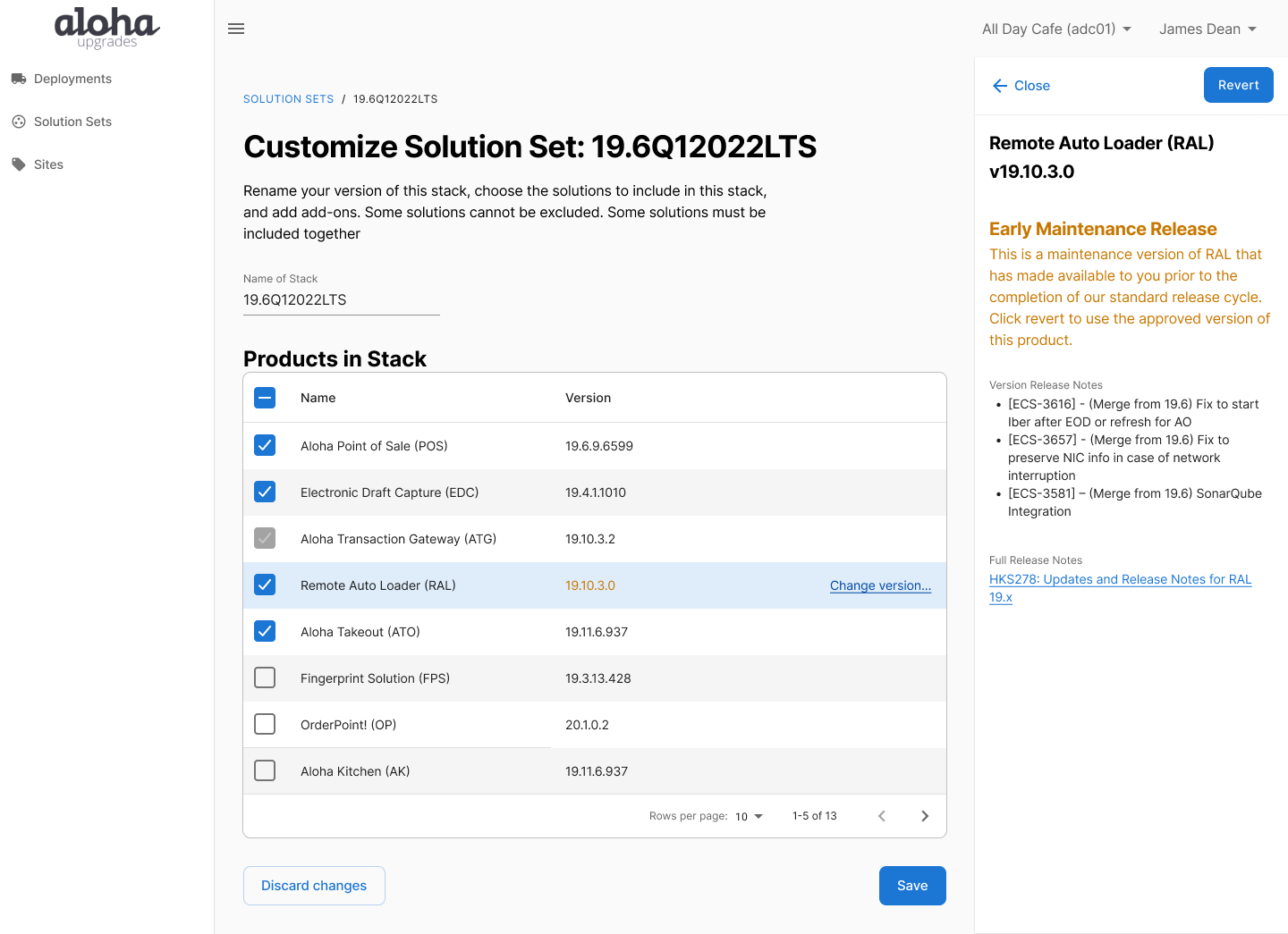
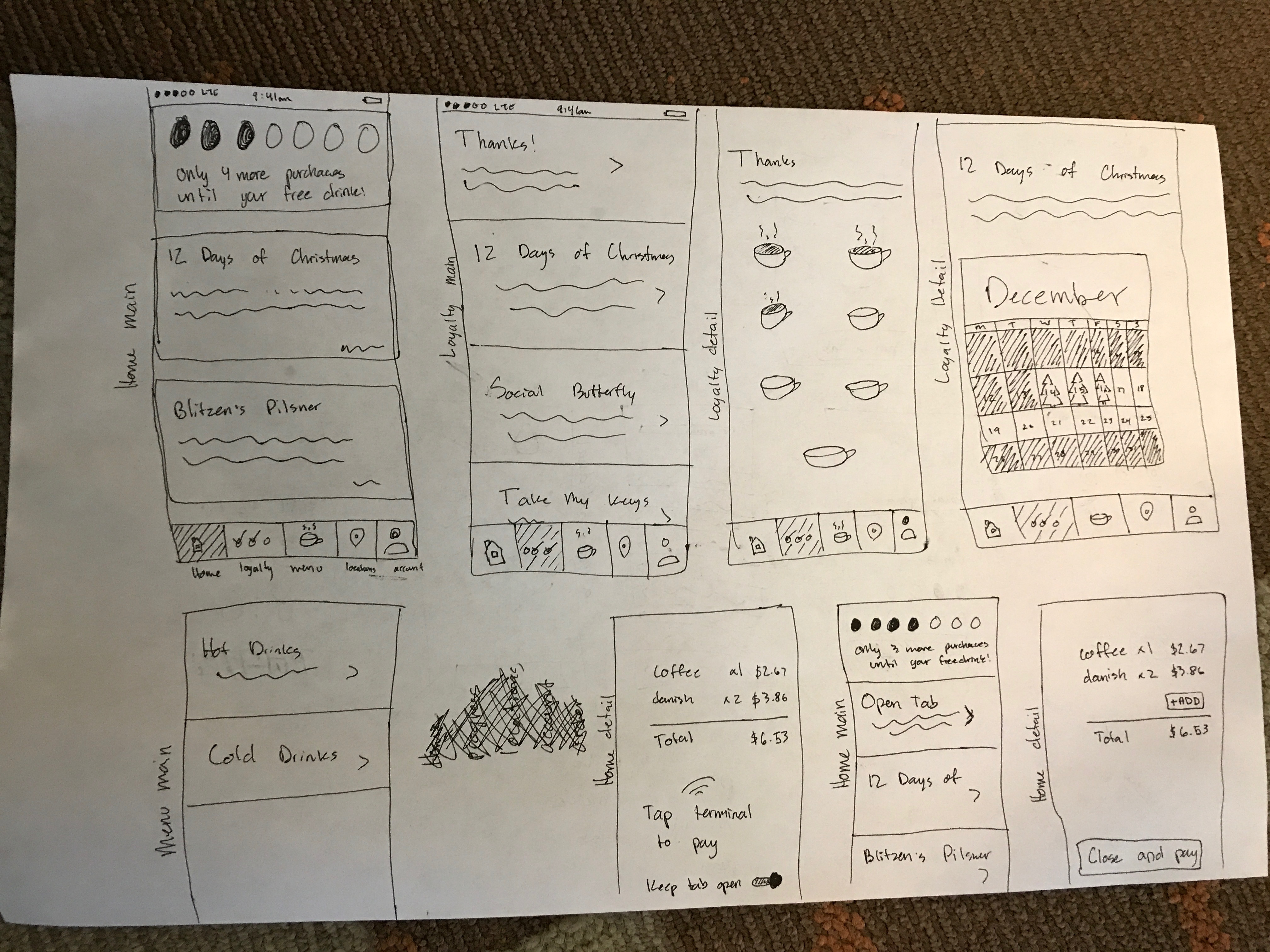
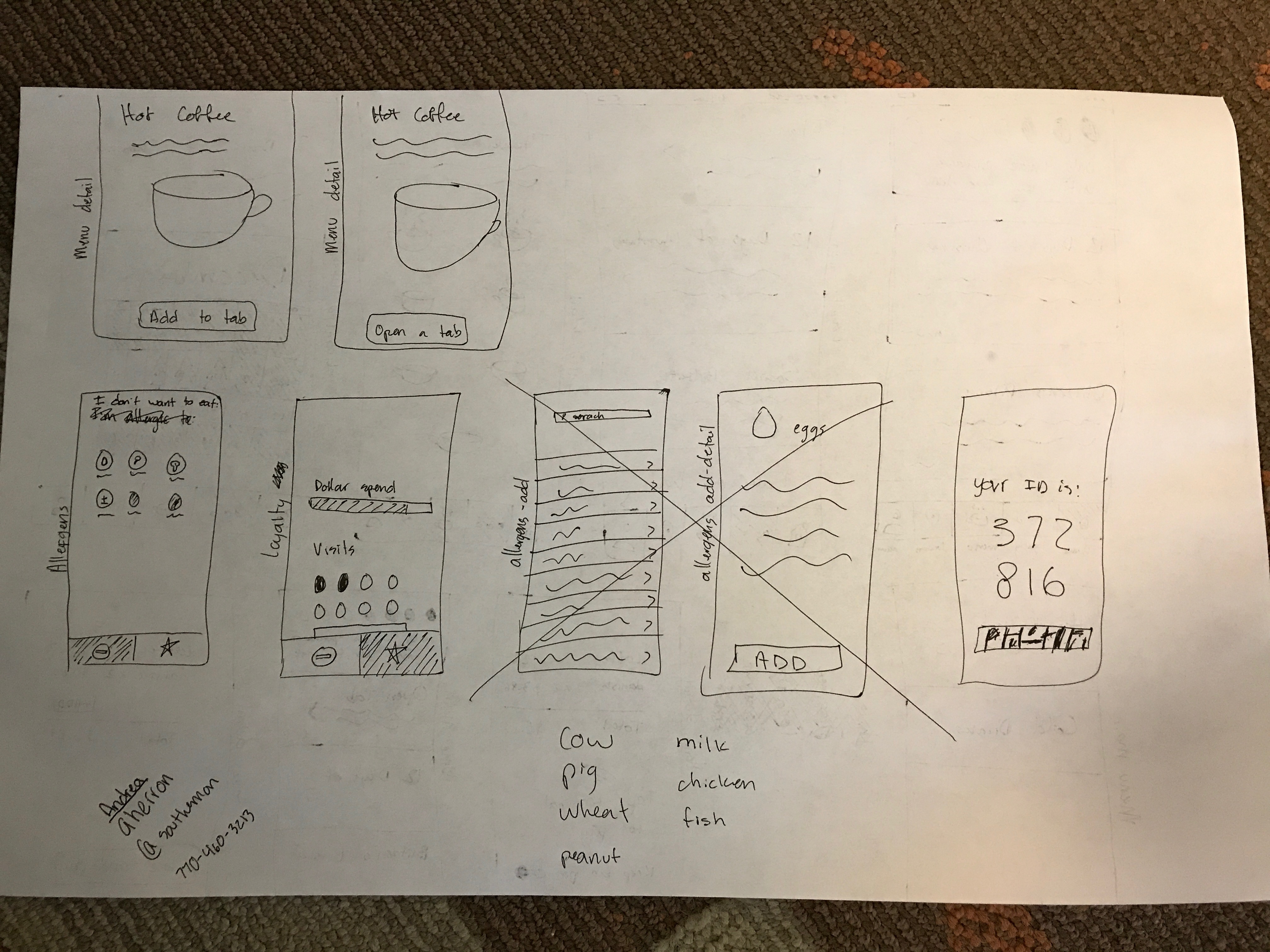
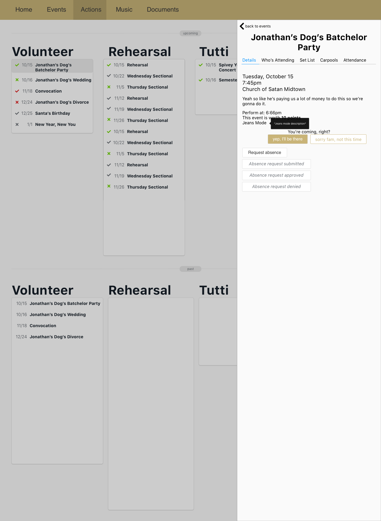
I can start a design from scratch, based on a business or user need, or work with existing ideas and designs to improve and iterate on them. I have experience in the entire design process from design, through prototype and build, to evaluation. I've used Figma extensively, but can also pick up a new tool easily. I'm also no stranger to good ol' pen and paper and can find a way to use any medium to express a design idea.

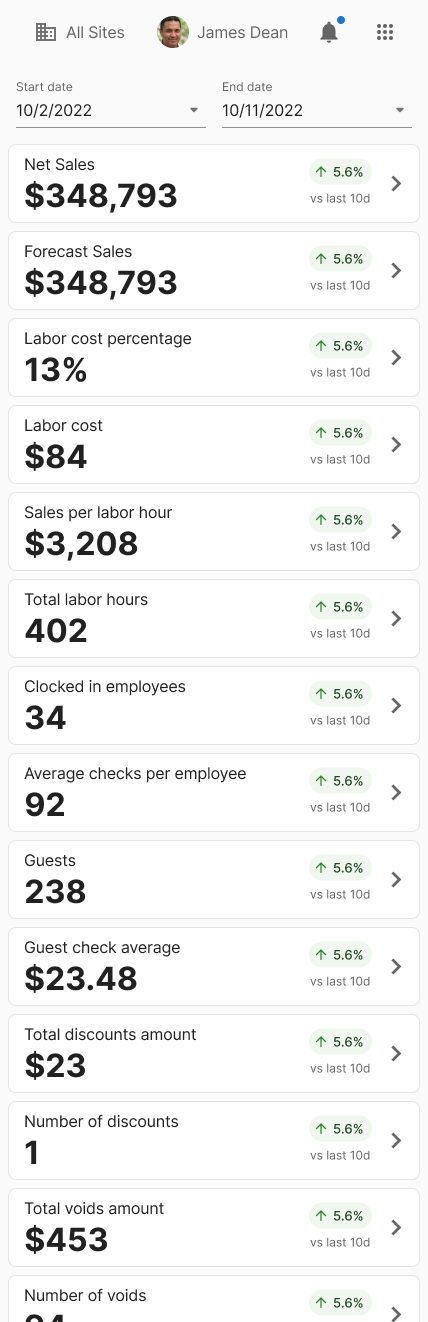
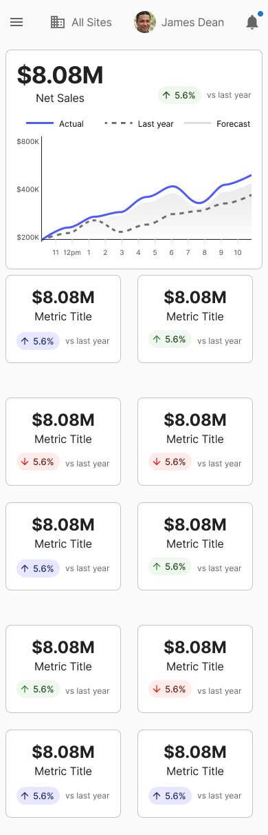
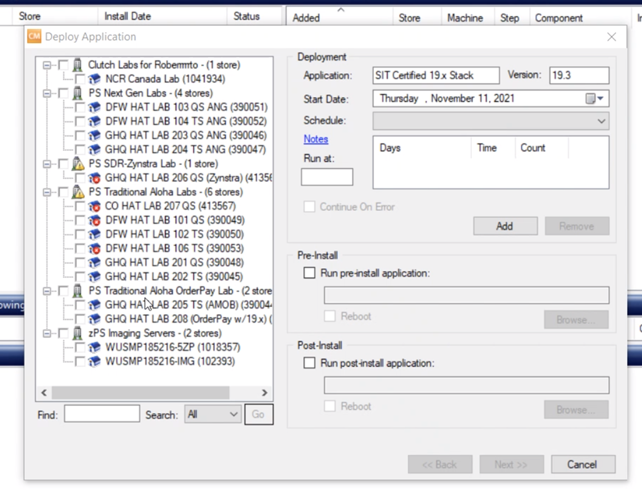
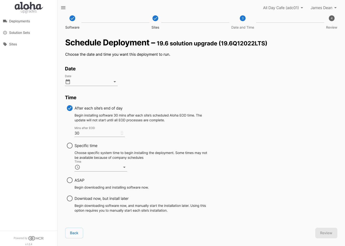
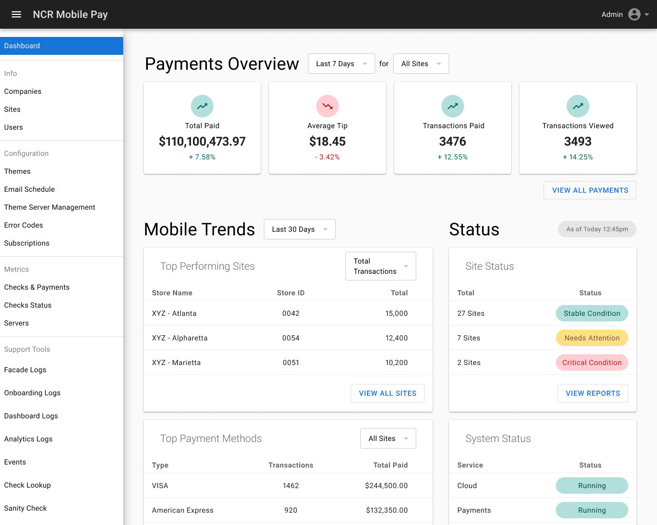
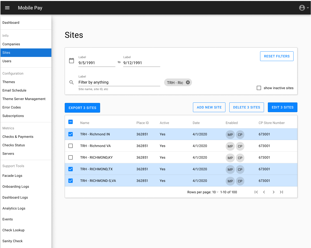
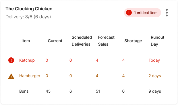
Most of my professional experience has been in enterprise business-to-business SaaS solutions, especially financial and operations technologies. While not always the most exciting work to show off to my family and friends, enabling business owners and operators to understand data, make decisions, and understand their situation is important! I've used design systems (and contributed to them) to ensure a consistent look and feel for users, and to jump start design work.

Prototype

I can make clickable prototypes in Figma, but I can also whip something up in HTML/CSS/JS. I can make looks-like prototypes and works-like prototypes and know when to do which. I can prototype small (but important!) microinteractions to complete applications and everything in between. I have also done physical prototyping making a smart mirror, "alternative" clock, color matching game, and listening octopus using Arduino and PCBs.

Evaluate

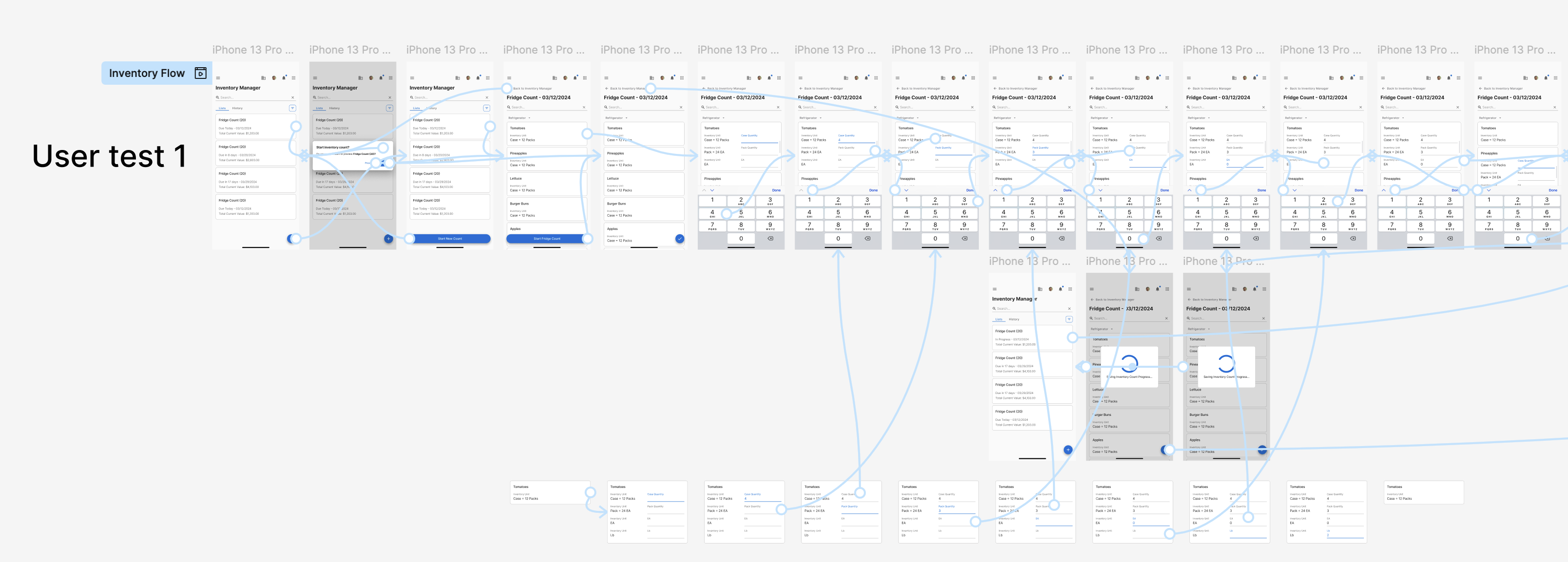
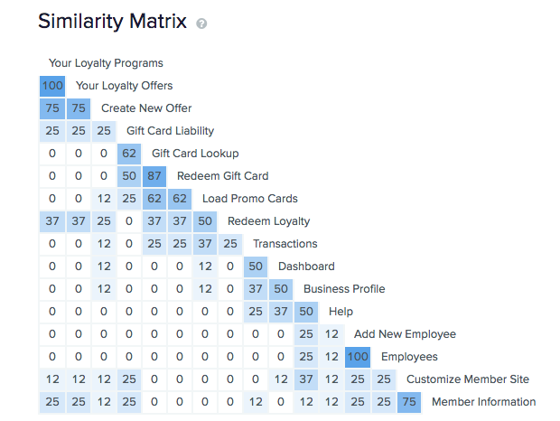
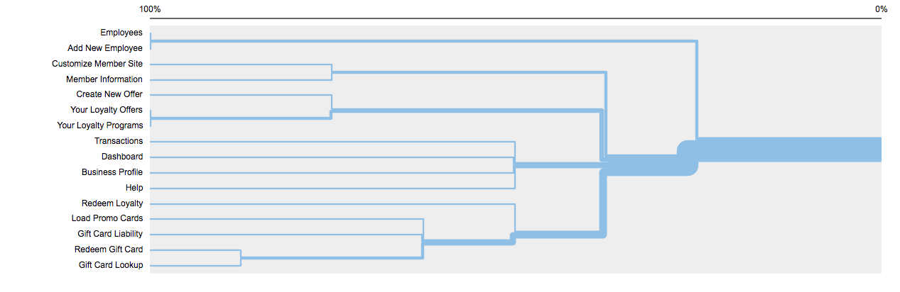
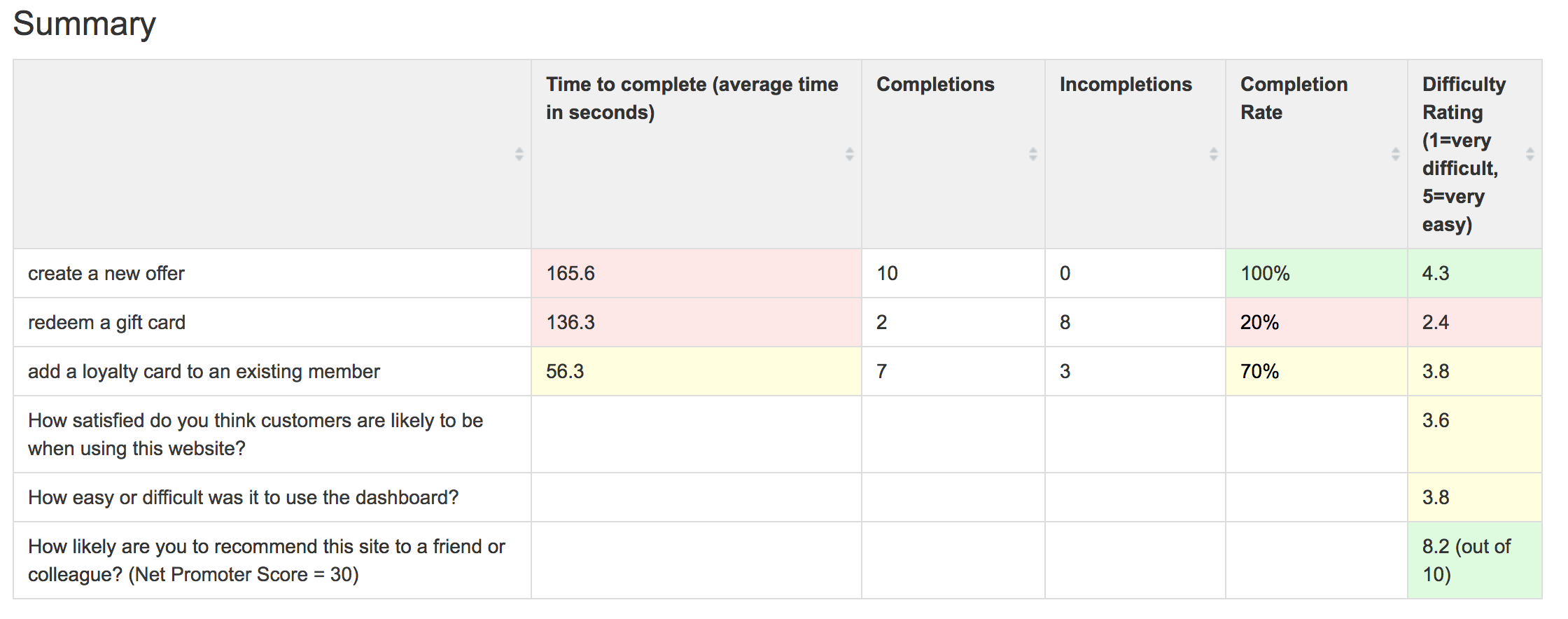
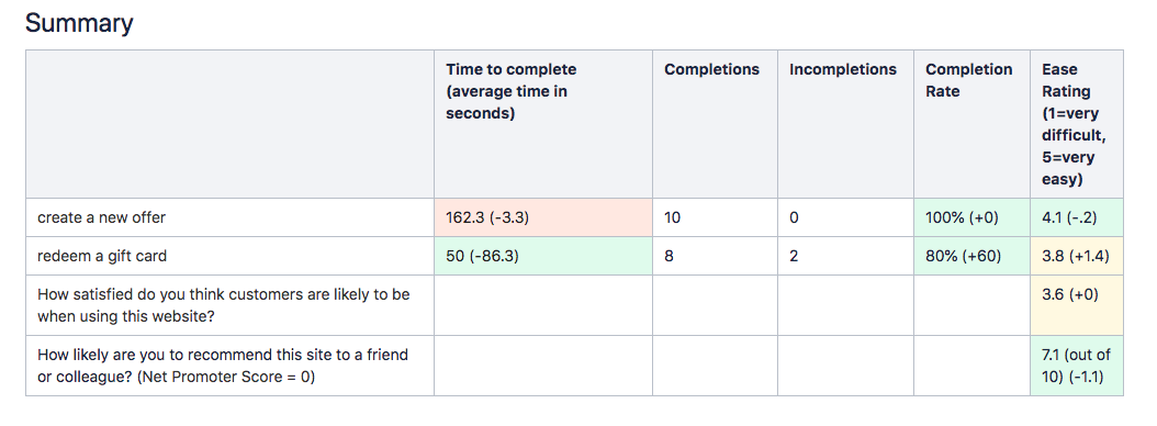
I can do moderated and unmoderated user testing with all fidelities of prototypes. I can use qualitative and quantitative methods to evaluate and iterate on many kinds of designs, from interfaces to physical devices. I can extract quantitative data from qualitative interviews and surveys, and conducted surveys and questionnaires. From guerrilla-type research a la "Don't Make Me Think," to more formal studies using tools like UserTesting.com, I can use a variety of methods and tools to evaluate different facets of a product to get at its usability or any other question we need to answer.

Contact Me

Like what you see? Want to know more?

Projects

Aloha Smart Manager

Aloha Smart Manager is a one-stop-shop for restaurant owners and operators to manage their business. It includes functionality for labor/employees, inventory management, sales data, and more. It's a huge project with 4 designers and I worked on the inventory features and everything else that didn't didn't fit into one of those categories like notifications, the dashboard, and site management.

I used Figma Make AI to generate ideas and come up with some initial wireframes, and also used Copilot to distill and understand our lengthy and detailed user stories and product requirements.

Strategic importance:

  • Replacing disparate tools and systems
  • Unified design system
  • Web-based
  • Mobile-enabled

Customer impact:

  • Single source of truth to enable business decisions
  • Synchronized data for deeper insights
  • Consistent NCR look and feel reinforcing branding
  • Simplified recurring billing model

Collaborators:

  • Product owners and project managers
  • Design system designers
  • Fellow project designers
  • Restaurant operation domain experts

Example Work: Cost of Goods Sold

The cost of goods sold report answers the question: "is my restaurant making money?" by telling you how much of a menu item's cost goes towards its ingredients, and walking you through the calculation so you can see where any problems are.

The low fidelity work started with gathering the appropriate data and organizing it from left to right to show the story of the calculations. Historically this report is a table, so to improve it we added interactive graphing and visualizations.

High fidelity work continued to implement the design system components, fill in the details of how the data should be organized and displayed so it's informative but not overwhelming: organize the many menu items into collapsible rows and keep a sticky column of the totals to keep the big picture visible.

To further leverage the web-based medium and integrate deeper into the larger product, I added links to the raw items indicated, inventory counts referenced, and added calculation modals to explain the math and show the numbers. I believe this is a ✨strategic advantage✨ over other products because no other product I could find does this, and it targets the less experienced users who may not know all the jargon or processes.

Example Work: Dashboard

And sometimes you have to come up with a lot of versions of something until you're happy and all the stakeholders are happy. We want a lot of information! But not too much... We want it to look pretty! But not be too much work for developers... We want it to be modern and hip! But not offend corporate tastes...

Iterate, iterate, iterate...

CFC Redesign

CFC is the ConFiguration Center that a restaurant owner and operator uses to manage their restaurant. This project was the very start of redesigning CFC to be web-based (instead of a Windows application), use the NCR look and feel, and enable customers to edit their configurations without having to call support for help. We started with the most used features: employees, users, and menu management.

Strategic importance:

  • Company standard React web
  • Reduce support calls (save money)
  • Reinforce NCR branding, look, and feel

Customer impact:

  • Vastly simpler experience
  • Significantly easier access
  • Run restaurant better, easier, and faster

Collaborators:

  • Product owners and project managers
  • Design system designers
  • System architects (migrating platforms)

Product owners identified the most-used features and goals of CFC and listed them out. From there I created an information architecture for the new web app, created low fidelity wireframes, and then adapted those to high fidelity mockups. Throughout this process I met with the product owners to verify my new approach met their needs and let me ask questions about possible vectors for improvements.

During this time the NCR design system was being developed and I contributed one of the first components, a detail drawer, by collaborating with designers on that project and thinking about what I needed and how that could be applied to other projects to create something that would work for everyone across NCR.

Aloha Update Update

Aloha Update is the software updating system for NCR products like points of sale, servers, kitchen displays, terminals, etc. It's very complex to update software because some machines may not have requirements like CPU or RAM, some software versions require other software versions, and timing the updates cannot block business operations.

Strategic importance:

  • Updated customer software = better experience
  • Reduce support calls
  • Additional path for upsells and revenue

Customer impact:

  • Easier to use and understand
  • No need to schedule updates with NCR
  • Get new features and security updates

Collaborators:

  • Product owners and project managers
  • System architects
  • Development manager

This is a very technical process and I learned a lot about how the system works so that I could represent that to the end user. I broke apart interfaces that had no help or explanation and tried to guide the user whenever possible.

Existing tool on the left, my design on the right

Mobile Pay

During the pandemic I designed a mobile web app for restaurant customers to pay their bill on their own device to minimize contact between restaurant staff and guests. I created a mini design system and prototyped interactive flows, all in Figma. Half of the project was the consumer-facing checkout flow, and the other half was the configuration tool the restaurant owner used to set up and customize the system.

Strategic importance:

  • Support restaurant operations during the pandemic
  • Web-based
  • Mobile-first

Customer impact:

  • Accept payments while maintaining social distance
  • Self-serve option to split checks and pay
  • Leverage NCR's new payment system

Collaborators:

  • Product owners
  • Project managers
  • Design director

Design

The world is already a scary, confusing place so I always appreciate when design makes things a little better. I love when something I thought was going to be difficult or confusing ends up being easy-peasy, and I do everything I can to pay it forward so someone else can have a glimmer of hope in these unprecedented times mired by uncertainty and confusion. Uh, well anyway... I have been using Figma almost exclusively since 2020 (and it's been wild to see it grow!) and have experience with other tools and techniques too.

Tools

  • Figma
  • Axure
  • Sketch
  • Literal sketch (pen and paper)
  • Adobe Suite
  • HTML and CSS

NCR (2019-2025)

  • Design system
  • Figma, Figjam, Figma Make
  • Copilot
  • Developer relations
  • Agile workflow

At NCR, I worked as part of a team and individually. I led several projects as the sole designer, championing for the user and their experience. I presented my work to non-designers underlining details that could be a competitive edge, and to other designers working on other projects to show how to use the design system, the paradigms I came up with to solve typical problems, and solicit feedback to ensure alignment with other NCR products and services.

Throughout these projects we baked accessibility in. Aside from being the right thing to do, it's a major selling point. Our food ordering kiosk hardware has a D-pad and a headphone jack, so we designed our non-touchscreen interactions around those. For screen-based interactions we consulted our accessibility expert and WCAG standards to ensure access for all. Major considerations include:

  • Color contrast
  • Iconography
  • Alt text
  • Screen reading
  • Tab order/keyboard access

Accessibility is much more than this, but these are the top-of-mind aspects for the data- and tables-heavy projects I worked on.

Elavon (2016-2018)

  • Axure
  • Agile process
  • UX evangelism
  • Baby's first job

Sketches for Elavon project (Fanfare), and hackathon ideas

When I was with Elavon, I worked on the initial design phase of a developer portal project, I researched competitors, similar products, and services, gathered existing feedback we already had, identified personas, wrote user stories, identified red route user journeys, and organized the information architecture.

Information architecture for the Elavon developer portal project

Charity Work

I helped found the GT Glee Club Alumni Association with 2 other alumni in 2021. As a 501(c)3 non-profit we accept donations and give scholarships to students, and organize alumni events. I am the treasurer, and also the webmaster so check it out to learn more about the organization and marvel at the website.

Prototype

Figma has made prototyping so much easier! I used to have to export the Sketch screens to InVision and hook everything up, but now with Figma you can keep it all together and design and prototype at the same time.

Mobile Inventory

This is a prototype for a feature of the restaurant management web app where restaurant employees can count the inventory of items in different locations through the restaurant. It is mobile first since it's hard to carry a laptop around, and designed to be as quick as possible since the freezer is cold! I worked on this with my junior designer.

Part of the prototype for Mobile Inventory Counting

To use the live prototype, use the main link flow, and start a shift count in the walk-in. Pretend you have 4 cases of chicken breasts, skip the packs, you're out of pounds, and you have 15 eaches. You have 6 cases of tomatoes, skip the packs, and you have 3 eaches. Pineapples are completely out of stock. Then post your count for review.

No-Visual Navigation

How can we make sure that people with low or no vision can use our food ordering kiosk? Inspired by the way smartphone read out their screens and working with the Center for the Visually Impaired I devised a system to read out the contents of the screen and guide the user through the ordering flow without needing to see the screen. I was able to test this with random employees at the office by reading everything out myself (using my best robot voice) and laying out the script like a flow diagram so when they pressed the left or right buttons I knew what to read next. Definitely the most fun prototype I've done!

Multi-Modal Board Game

This board game is a a Super Smash-style melee. Players lose and gain coins, and if they have enough for the fare, the motor spins and where she stops, nobody knows! This board game uses RFID to detect when players get on the merry-go-round. Players use the Processing sketch to roll the dice and steal each other's coins.

Evaluate

At NCR I was spoiled because we had a whole research team that was able to take our questions and uncertainties and run with them and figure out where the pain points were and what worked well. But sometimes research can just mean asking someone what they think of a design real quick and can take less than 5 minutes and be really informal. Plenty of problems can be identified that way without finding participants, running a screener, and waiting for results.

Why not use your Instagram followers to ask a research question?

Information Architecture

I'm a big believer in information architecture. I love organizing data and thinking about abstractions. A clear taxonomy is an important part of the user experience, which sometimes gets overlooked or bloated. I like to use stickies (digital or real) to map out the high-level structure of a product. I also use card sorts, similarity matrices, and dendrograms to help with this.

Post-its! Matrices! Dendograms! Oh my!

Loyalty Program Management

I tested the product before doing anything (oh no look at all that red!), and then after my redesign. You can see the time to complete the tasks is down, the completion rates are up, and the ease of one task went up while another went down (ops, Something to work on!)

Decided on some metrics and tested them before and after

Masters Project

My masters project collects data automatically about usage and performance to measure its efficacy. This is a custom-designed and -implemented solution specifically and only tailored to this project. Data is automatically collected and analyzed to show total errors (hopefully decreasing over time) and distance from the target (also hopefully decreasing over time). This project involved submitting a formal research proposal and getting approval from the IRB. You can read the incredibly interesting and not at all boring report here (tl;dr it worked a little bit).

Bonus Content

Random fun stuff I've done. Some of it is good, some of it isn't. I'll let you decide which is which.

Loading Spinner

The Aloha Smart Manager project involved a lot of data and sometimes there were wait times, and we needed something to entertain the user with so they'd be OK with the downtime. I came up with a prototype in HTML/JS/CSS that is food themed (since it's restaurant software, after all) and had some randomization and whimsy built in to try and keep it fresh over several visits. Check it out here!

Glee Club Management

Worked with the Georgia Tech Glee Club to design an event and people management system for them to keep track of the gigs and attendance. It's a surprisingly complex system where events are worth points on student's grades, different uniform requirements event types, and attendance taking.

Homepage for the Glee Club management site

College Cost

This is an exercise to learn d3 to show how much college costs over time in terms of number of hours of minimum wage work. As someone who worked a minimum wage job in college, you can see how minimum wage in no way keeps up with the cost of school. I draw the graph based on the data, but it's not interactive at all. Check it out

Protein Efficiency

I went on a big long diet where I needed to get a lot of protein but not many calories, so I needed to know which of the foods I like / that I eat a lot would be the most efficient for hitting my protein goals. Near the end of the day I'd realize I didn't have many calories to spend, but I still needed a bunch of protein. This uses d3 to organize and draw the graphs. It has some interactivity. Check it out

Ear Training Mini-Game

This little game just asks you to identify if the second note is higher or lower than the first one. Starts with a big gap that should be pretty easy and then gets narrower and narrower. The colors get more similar as the notes get more similar, and the orbs get closer as the gap gets narrower. I used web audio to synthesize the sounds. See how well you can do!