Evaluate

User Research

I have used qualitative and quantitative methods to evaluate and iterate on many kinds of designs, from interfaces to physical devices. From guerrilla-type research a la "Don't Make Me Think," to more formal studies using tools like UserTesting.com , I use a variety of methods and tool to evaluate different facets of a product. I have extracted quantitative data from qualitative interviews and surveys, and conducted surveys and questionnaires.

Information Architecture

I'm a big believer in information architecture. I love organizing data and thinking about abstractions. A clear taxonomy is an important part of the user experience, which sometimes gets overlooked or becomes bloated. I like to use stickies (of course) to map out the high-level structure of a product. I also use card sorts, similarity matrices, and dendrograms to help with this.


Stickies 4 life

Which things are like other things?

How do things group together?

Developer Portal

Once we launched the site, I did 2 tests to see how usable it was and to get any feedback from users. The May test and the June test helped answer open questions I had about specific aspects of the site.

Results from the May test

Results from the June test

Transaction and Reporting Tool

A major project I worked on for Payments Insider was to figure out how well Payments Insider works for the large businesses. Most of the businesses who use it have 1-2 locations like a mom n pop store. But there are a few really big ones like Foot Locker and Hilton. Those big guys use a different poduct that is sunsetting, so we needed to figure out how to make their transition to Payments Insider painless and eventually work even better for them.


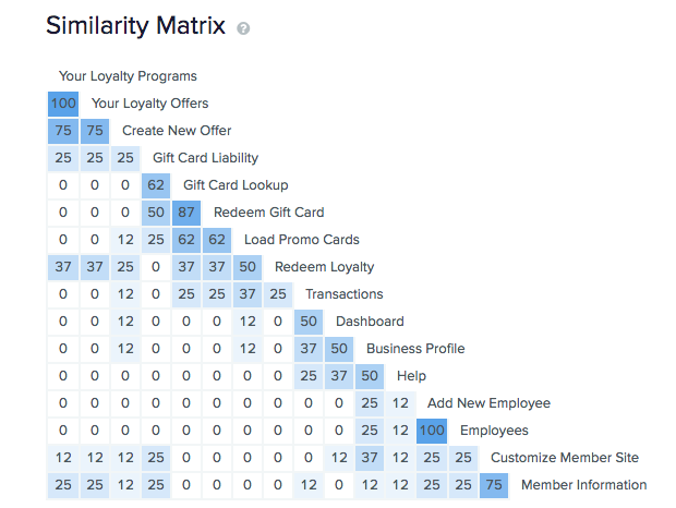
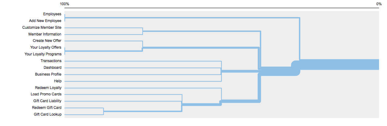
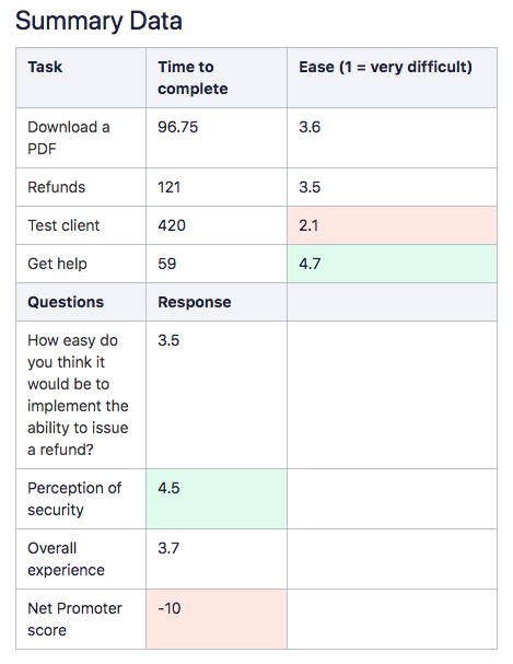
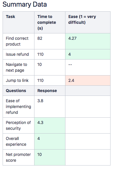
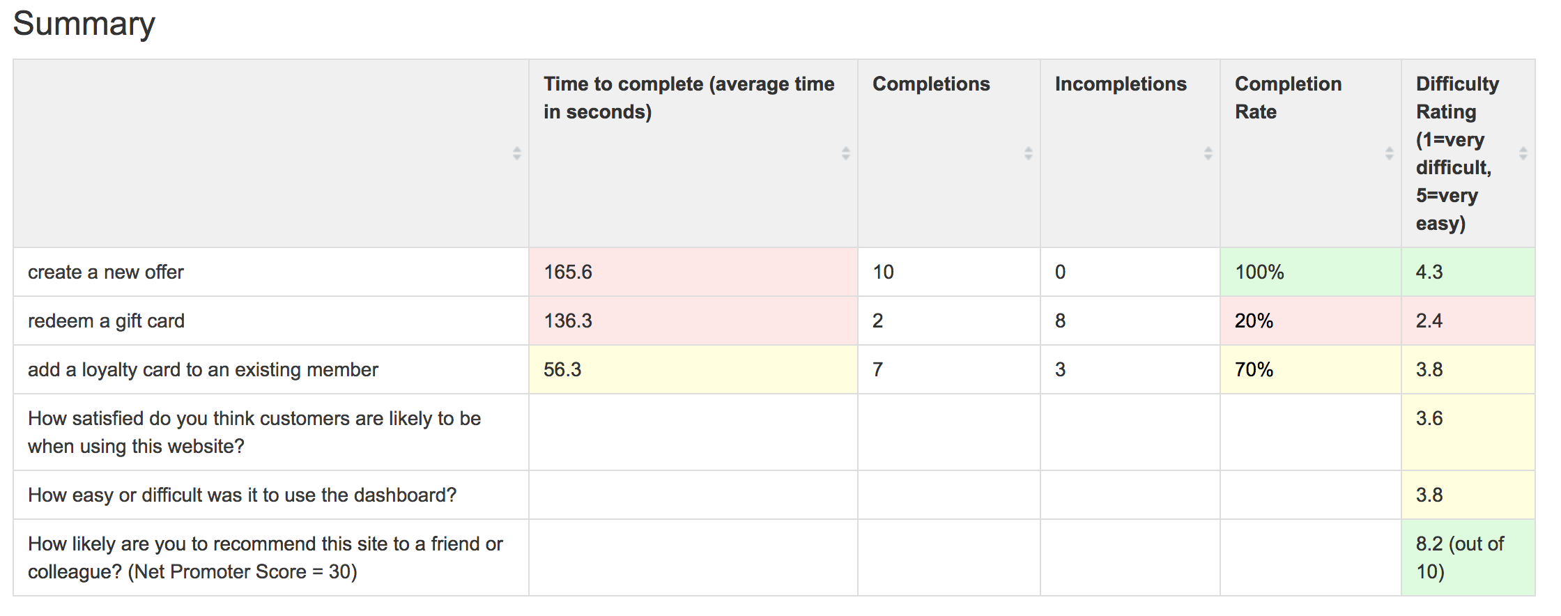
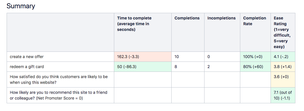
Over the course of two months I interviewed everyone I could who used Payments Insider to get their thoughts, feelings, hopes, dreams, and any other feedback about the product to see what we could do to make it work for the way that they run their business. I gathered their feedback about everything I could: how long it taked to log in and get to a report, the langauge of the site and if it makes sense, where do they expect information and functions to be, and the order of the columns in the exported spreadsheets.


This research really opened our manager's eyes to the issues the users face when trying to use the product. It's one thing for us, the deisgners, to say there's an issue, but when the huge, important clients say they're frustrated with a function of the site, the management listens!

Program Loyalty Management

These are the results of the legacy design I took over. These are the results of my redesign. I used these results to improve my new design. You can see the time to complete the tasks is down, the completion rates are up, and the ease of one task went up while another went down (Oops! Something to work on)


Stats for the existing site

Stats for my proposed redesign

Masters Project

My masters project collects data automatically about usage and performance to measure its efficacy. This is a custom-designed and -implemented solution specifically and only tailored to this project. Data is automatically collected and analyzed to show total errors (hopfully decreasing over time) and distance from the target (also hopfully decreasing over time). This project involved submitting a formal research proposal and getting approval from the IRB. You can read the incredibly interesting and not at all boring report here (tl;dr it worked a little bit).

Migraine Relief

This research project was over the course of a semester and involved real users and data. In order to alleviate pain caused by migraines, we investigated the ways people manage their pain and what they would like to have to help them do that. This involved submitting a formal research proposal and getting approval from the IRB.


You can see the final summary poster here and read the final report here .

Website Accessibility

I have used Morae to evaluate and test websites with real users, especially those with various disabilities.


I identified accessibility issues with the project I took over at Elavon. Text did not have enough contrast, and screenreaders were not taken into consideration when writing the markup. I started an internal guide for designers and developers to implement the low-hanging accessibility fruit.